
Tuesday, September 25, 2007

Sites to check out.
1. http://greekdesign.free.fr/theogennitsakis/
To me, this style of layering seems definitive of the "it" style now. Plus some '80s retro.
2. http://fontleech.com/links
Free fonts.
3. http://www.espira.co.uk/
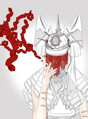
Espira is Frida Kahlo, Haute Couture, and Politics. Gorgeous.
To me, this style of layering seems definitive of the "it" style now. Plus some '80s retro.
2. http://fontleech.com/links
Free fonts.
3. http://www.espira.co.uk/

Espira is Frida Kahlo, Haute Couture, and Politics. Gorgeous.
Fashion [turn it to the left]
Pictures from Style.com
Drama-McQueen

Color-Balenciaga

Inspiration
Vera Wang - early-twentieth-century Russia

Marc Jacobs- Edward Hooper

Louis Vuitton [Marc Jacobs]- Johannes Vermeer


Drama-McQueen

Color-Balenciaga

Inspiration
Vera Wang - early-twentieth-century Russia

Marc Jacobs- Edward Hooper

Louis Vuitton [Marc Jacobs]- Johannes Vermeer


Saturday, September 22, 2007
BFA ideas


It is thrilling and scary to work on something where they say "whatever you think of just show us something." It's an art exhibition but they have no idea what will be in it until the middle of november, but this invitation is due to the printer at the beginning of november.
These are going to be 5 X 7, so more intimate than a poster.
Are these Legible?
Thursday, September 20, 2007

I am one of those people who listens to every director's commentary on my favorite DVDs, the other day I listened to Little Miss Sunshine's for the first time. When they were talking about this opening sequence they said that Steve Carell looked so sad in this opening they decided to put the title over his face as way to signify quirkiness or something is going to be a little bit irreverent about this movie. When they said that I remembered that when I first saw the movie the title came stair-stepping across his face and it did make me laugh. Lesson learned: placement can give you incite and set a mood separate from the one a visual gives.
Another Question
I just filled up my computer's memory so I'm sure I'm at the point where I need an external hard drive. Do any of you guys have opinions on which ones you think are good deals or hassle-free?
[oatmeal should always be eaten warm.. eck!]
[oatmeal should always be eaten warm.. eck!]
Subscribe to:
Posts (Atom)